Ever wondered which is the most beautiful and iconic world cup logos?
The FIFA World Cup is arguably the biggest global sporting tournament in the world, and when it comes to the official designing of the host country logo, the official branding agency must be able to design something unique, attractive, and reflecting the essence of the tournament.
While it is a must that the logo design of the world cup needs to convey elements of the host country, to mark the preparation of the 2026 mundial in United States, Mexico and Canada let’s look at the most beautiful and iconic logos in the history of the tournament.
The 2026 World Cup which is going to be co-hosted by three nations is returning to the Northern and Central America for the first time since 1994, and with the next tournament three year away FIFA released a new logo boasting a white ‘2’ which is stacked on top of a ‘6’ with the famous world cup trophy on top of the two numbers.
Korea/Japan – (2002, World Cup)
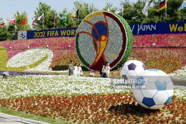
For the first time in the history FIFA World Cup, the biggest global sporting showpiece was held in Asia during the turn of a new millennium in 2002 and it was South Korea/Japan who were favoured to host the whole-world.
According to report the tournament in 2002 kicked off a wave of modern geometric logos that put the focus back on the trophy rather than the ball, and the global community of fans rather than the host country.
Aside the fact that the world cup lived up to expectation and also brought about a lot of surprises, the logo created by ‘Interbrand London’ ranks as one of the most beautiful and iconic logos in the history of the mundial for how well the trophy and banner-waving fans was outlined perfectly.
Germany – (2006, World Cup)
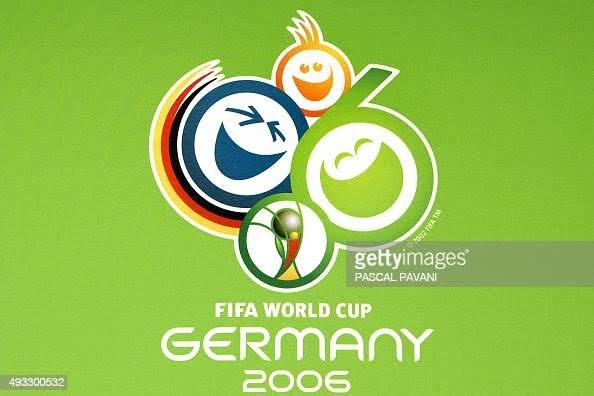
The 2006 World Cup hosted by Germany also follows in the footstep of it’s predecessor for the first time in the history of world cup logo.
As a world cup in 1974, West Germany only had a minimal two-color logo that only depicted a ball flying through the air, but in the turn of a new millennium the unified Germany opted for a much more colorful, unique, attractive and cheerful design.
Though it was reported that Germany had bought their way into hosting the global showpiece, but no evidence of vote-rigging in the awarding of the 2006 tournament was found.
Russia – (2018, World Cup)
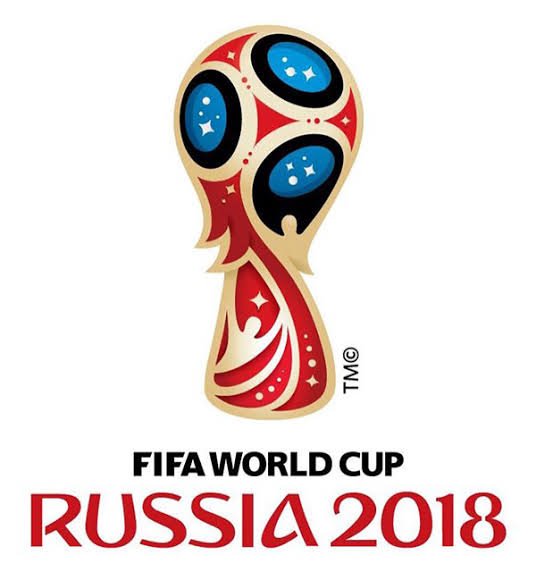
The official emblem for the 20018 tournament in Russia was first unveiled by three cosmonauts of the hosting country.
The logo was the first in the history of the global showpiece that carried a more decorative and ornamental flair in it’s design, even though it was criticized that it wasn’t beautiful enough.
The logo depicts the world cup trophy in red and blue, with it’s color depicting the Russian flag with a touch of gold trim on the design which makes it ranks as one of the most iconic world cup logos in the history of FIFA.
France – (1998, World Cup)
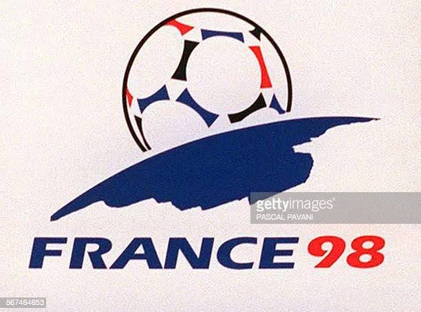
The brand logo for the 1998 World Cup in France was designed by French design agency ASDA and was presented on 20th September 1994.
The emblem carried a ball rising over the horizon of the earth like the sun with the red and blue color of the country’s flag mixed with black.
Les Bleus logo for the world cup in 1998 didn’t only turned out to be one of the most beautiful and iconic emblems in the history of FIFA mundial, the mascot of the tournament named ‘Footix’ was also regarded as one of the finest.
Italy – (1990, World Cup)
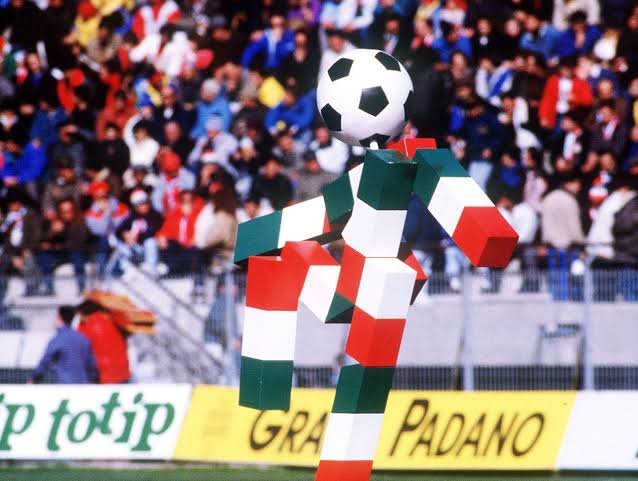
For those who are privy to watch the Italian 90 in blood and flesh, what would come to their mind is how brilliant the late Diego Armando Maradona put the fans on the edge of their seats.
Aside the brilliance of Maradona and every other players that shone at that showpiece, what some wouldn’t forget about the tournament was how beautiful and colorful the logo was.
The Italian logo didn’t only oozed uniqueness, it bucked the trend with it’s mascot by translating the stylized graphic look and feel of the logo design into a character called ‘CIAO‘ meaning hello or goodbye.